BIC / VML Brasil · 2025–2026
The Shakespeare BIC
Rebuilding Shakespeare’s handwriting for a robot.
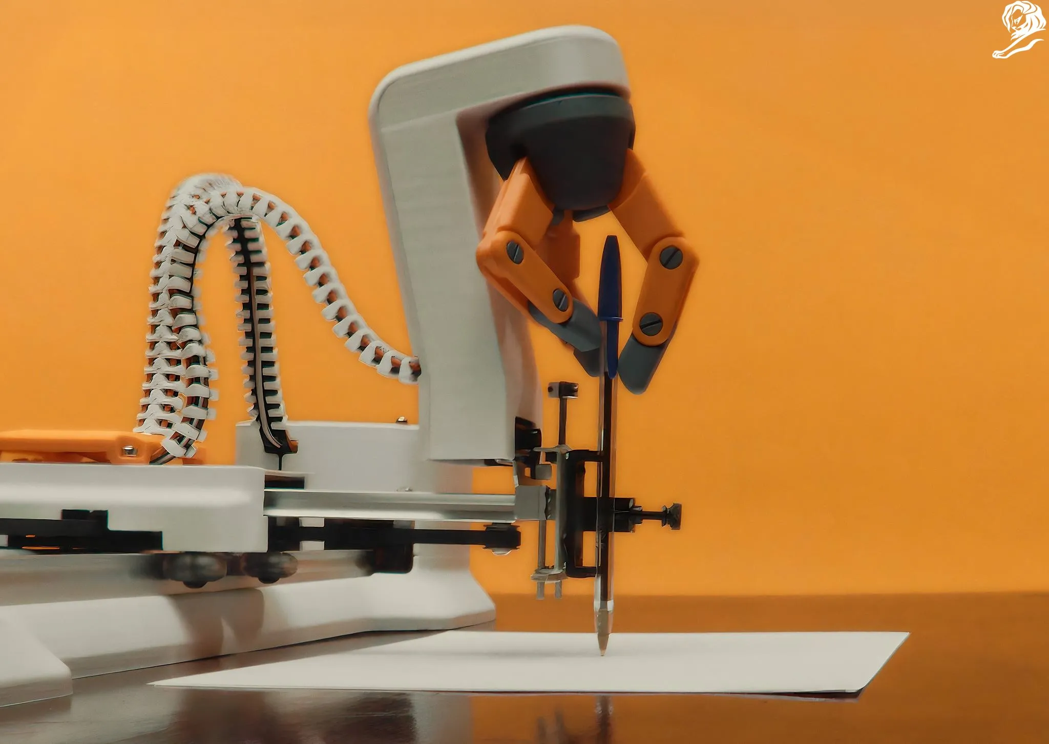
I rebuilt handwriting attributed to Shakespeare as a single-line system that a robot could write with one BIC pen.
BIC / VML Brasil
UX/UI & AI Systems Engineer
AI-assisted design, Generative typography, Robotic writing
2025–2026
01The brief
Could one BIC write an entire classic?
A BIC Cristal can write for up to three kilometres. For the pen’s 75th anniversary, VML turned that claim into a very literal brief: write an entire book with one pen. The book was Romeo and Juliet.
The idea depended on two things working together. We needed a credible version of Shakespeare’s handwriting, then a way for a robot to draw it page after page in real ink.
02How I contributed
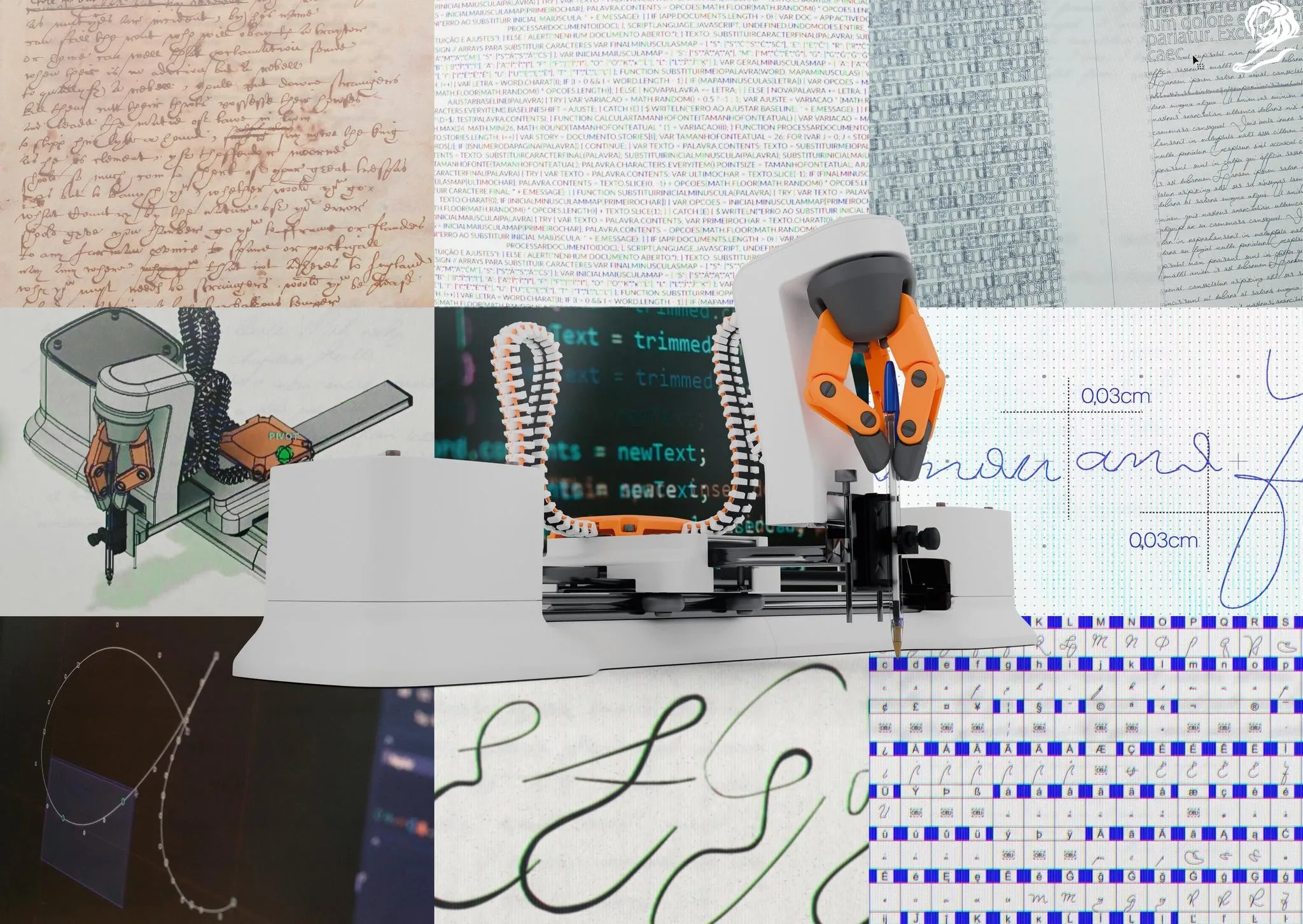
Building an alphabet from three surviving pages
There is no surviving manuscript of Romeo and Juliet. The closest material we had was three pages from Sir Thomas More that are widely attributed to Shakespeare.
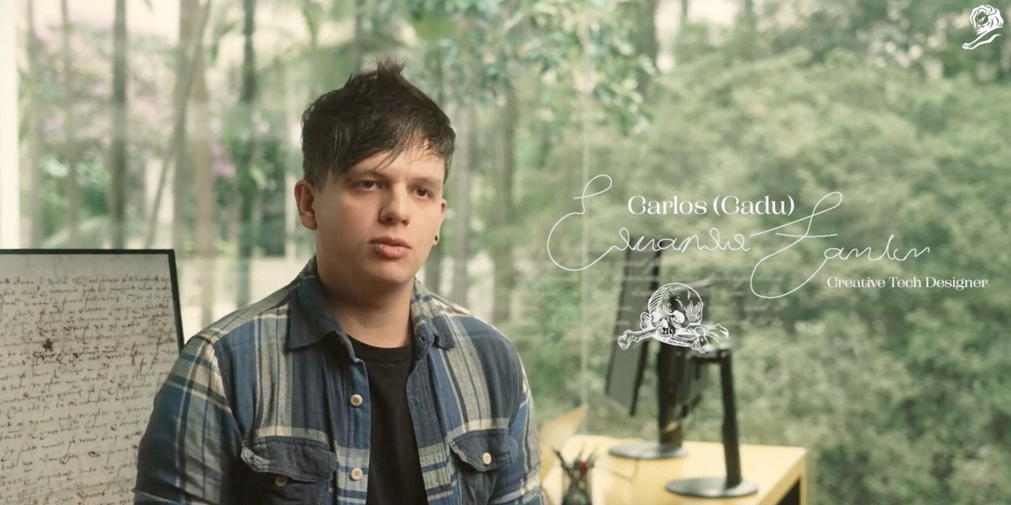
I joined the project through Bolha and took responsibility for the handwriting system. The source scans were old, small and difficult to read, so I built an AI-assisted restoration workflow using computer vision to enlarge and clean them for analysis.
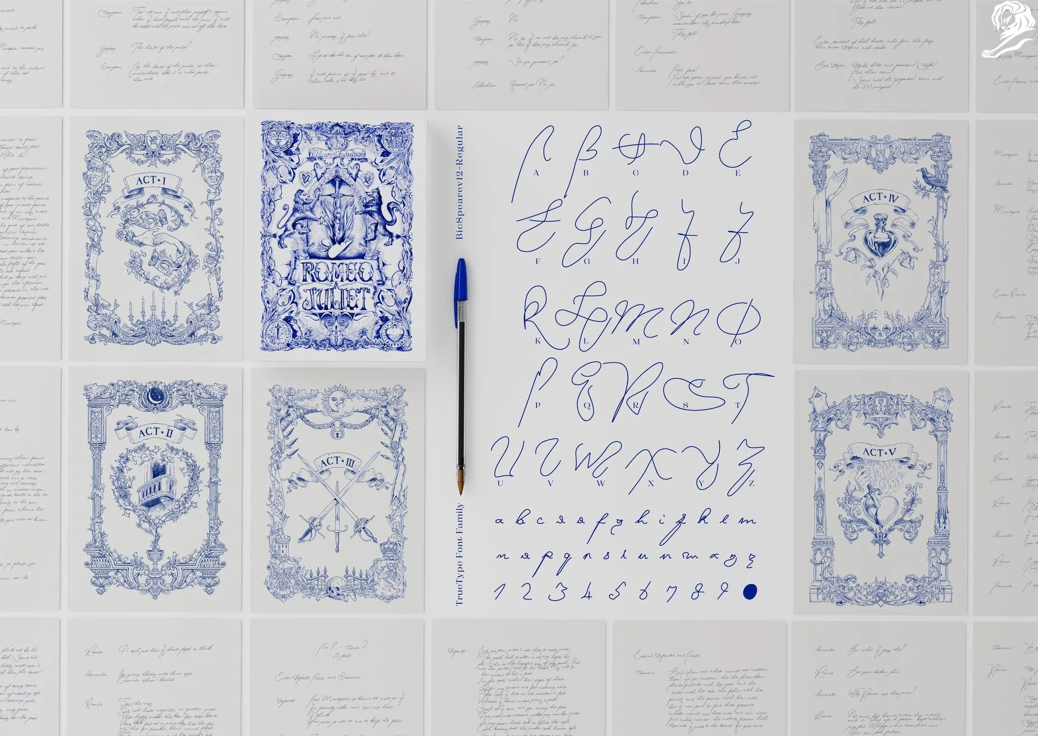
A second workflow helped turn the cleaned bitmaps into single-line vectors. Those outputs were only a starting point. I compared samples, interpreted incomplete marks, redrew the paths by hand and worked with the team to assemble the alphabet and its variants into a font family for the robot.
03Letter system
A font drawn as one continuous route
Most digital typefaces are closed outlines that get filled on screen or in print. A drawing robot follows those outlines and traces both edges of a letter, leaving a hollow shape on the page.
The robot needed a path through the centre of each stroke. I built every character as a single-line route that told the pen where to start, how to move and where to finish.
A curve could look right on screen and still move badly on the machine. Starts, endings and joins had to work as physical gestures as well as letterforms.
04Variation
Making 212 pages feel handwritten
A single lowercase “a” repeated across 212 pages quickly starts to look typeset. I drew multiple versions of uppercase and lowercase characters so identical forms would not keep clustering on the page.
Some glyphs also had contextual forms for the beginning, middle and end of a word. The choice could respond to where a letter appeared and how it connected to its neighbours while keeping the writing recognisably from the same hand.
The alphabet went through 23 iterations. More than 22 features of the handwriting were studied, with calligraphic and forensic feedback returning to the drawings between each round.
05Testing
The page had the final say
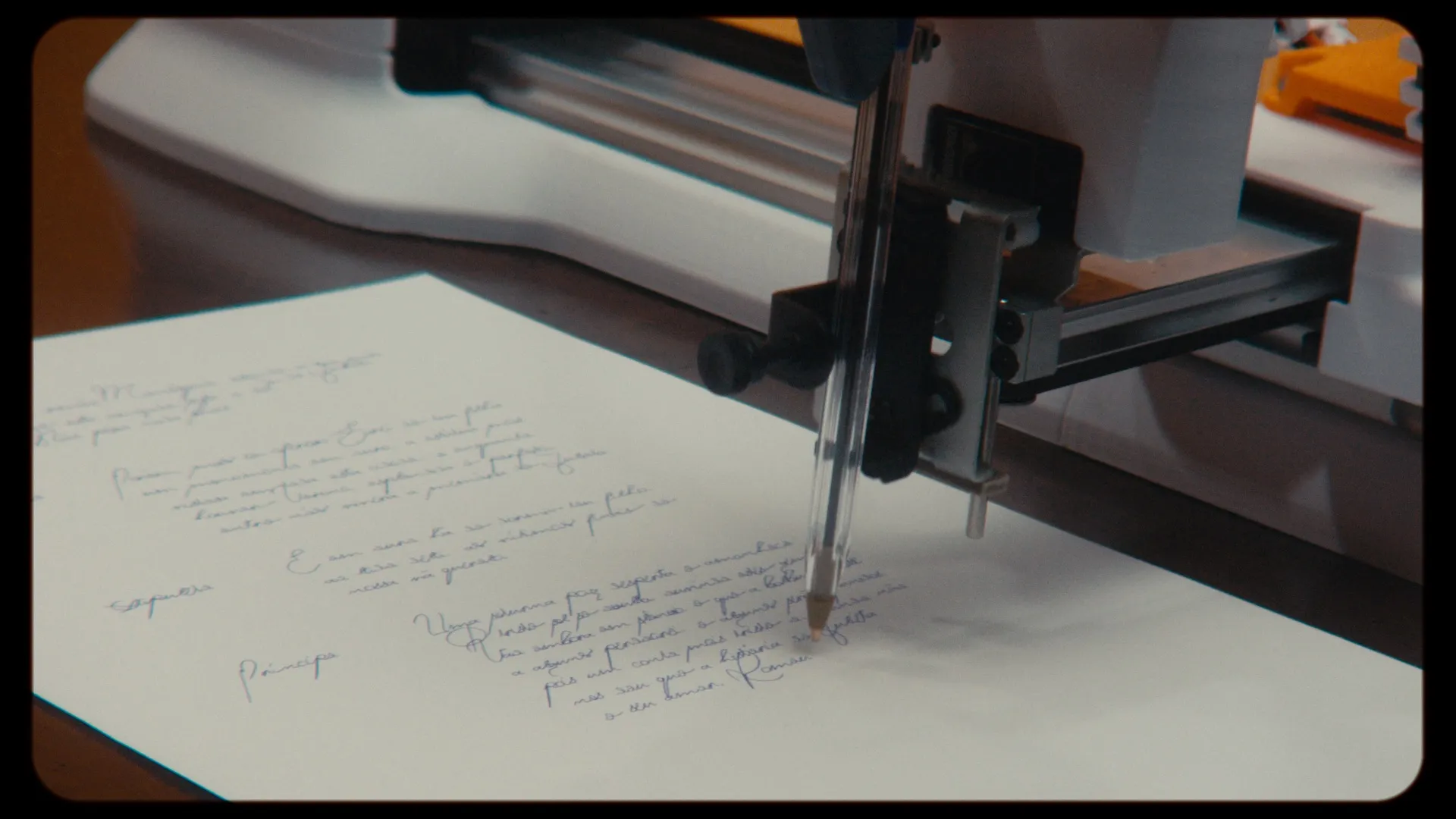
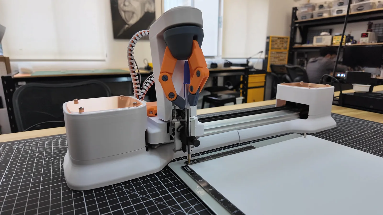
The lettering and robotic setup were refined side by side at Bolha. I worked closely with the people configuring the machine, testing each pass in ink and bringing the awkward movements back into the drawings.
A point that looked harmless in Illustrator could create a strange join or an unnatural pause on paper. The robot made those problems obvious. Each test helped us simplify a path, adjust a connection or rethink how the pen should travel through a word.
The team also developed a custom holder for the BIC Cristal and calibrated the machine around the pen, paper and final page size.
06In the world
Two books, written one stroke at a time
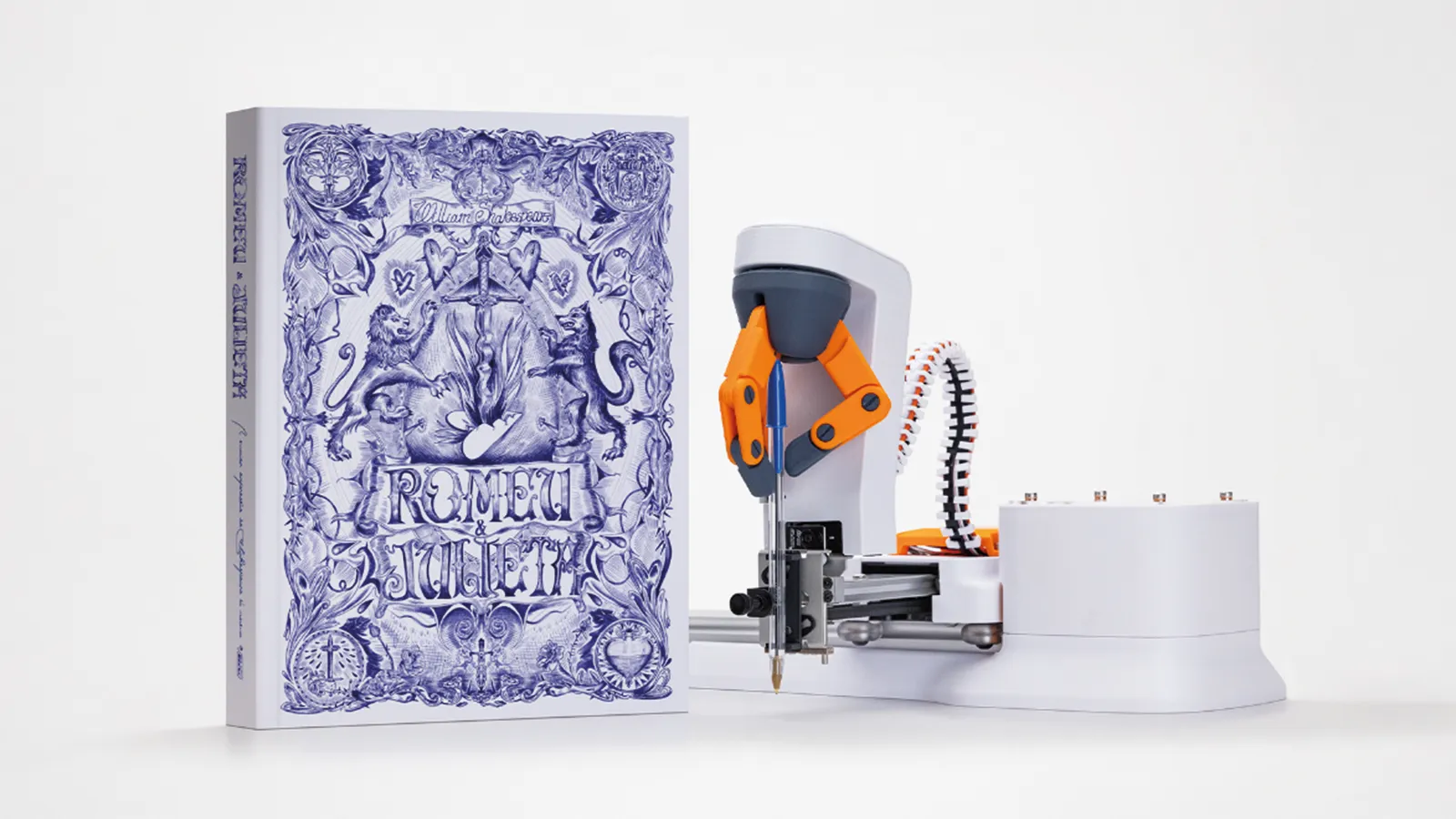
The robot spent 20 days writing the first Portuguese edition, all 212 pages of it. The finished book was presented to the Real Gabinete Português de Leitura in Rio de Janeiro, while a second copy remained with BIC.
A 226-page English edition followed and went to the Royal Shakespeare Company in Stratford-upon-Avon. The same BIC Cristal was used for the text and illustrations. The finished pages turned the pen’s three-kilometre claim into something you could hold.
07Looking back
Keep human judgment close to the pipeline
I used AI in two specific parts of the project. One workflow made the scans easier to read. Another gave us a faster route from bitmap to vector. Around those tools, the work was source comparison, drawing, path cleanup, font assembly and a lot of tests in ink.
The handoffs needed the most care. Someone had to judge what in a damaged scan was credible, which path kept the character of a stroke, where a variant belonged inside a word and whether the robot’s movement still felt like handwriting on paper. That balance has stayed with me: build useful tools, know where they stop helping and remain close enough to judge the result.
Recognition
Selected awards
The project received awards in design, typography, print, AI craft and creative technology. A selection:
Silver in Design and Print & Publishing; Bronze in Industry Craft.
(opens in a new tab)The One Show · 2026Gold, three Silver, four Bronze and two MeritsRecognition across AI craft, typography, data, design, print and creative technology.
(opens in a new tab)Clio Awards · 2026One Gold and three Silver awardsIncluding Gold for Art Direction and Silver for Typography, Print and Creative Use of Data.
(opens in a new tab)El Ojo · 2025Gran Ojo, Gold and two Silver awardsRegional recognition in Design and Print.
(opens in a new tab)Gerety Awards · 2025Gold in the Innovation CutAwarded in Print, Press and Single.
(opens in a new tab)London International Awards · 2025Bronze and FinalistBronze in Print and a finalist placement in Print Craft / Visual Design.
(opens in a new tab)Read more
Where the project is documented
The public case film follows the project from the handwriting source to the finished book.
(opens in a new tab)Project caseBolha: One BIC, One Book, Two ClassicsBolha’s own case page, with process images and an overview of the technical production.
(opens in a new tab)Making ofClube de Criação: Romeu e JulietaDetailed launch coverage of the source research, alphabet development and production process.
(opens in a new tab)Awards archiveThe One Show project recordAn English-language overview of the idea, execution, reported results and credits.
(opens in a new tab)CreditsClube de Criação: Cannes 2026 recordThe most complete public campaign credit list, including my Designer credit.
(opens in a new tab)Design archiveD&AD: The Shakespeare BICA concise international project summary and image gallery.
(opens in a new tab)Credits
AgencyVML Brasil
ClientBIC / Cristal Dura+
Technology productionBolha
UX/UI & AI Systems EngineerCadu Fantin
Image productionHogarth Worldwide Brasil / Team VML Brasil
IllustrationMarcelo Braga and Antonio Luvs (Studio OIO)
Book printing and productionP+E, Renata Manzke, Sônia Negrão, Fernanda Fiore and Marcio Ranoel
Sound productionCarbono Sound Lab